


The color matching of home decoration is the first element. When considering decorating your home, you must have an overall color scheme to determine the decoration color and the choice of furniture and decorations. If you can use colors harmoniously, you can decorate your beloved home more freely.
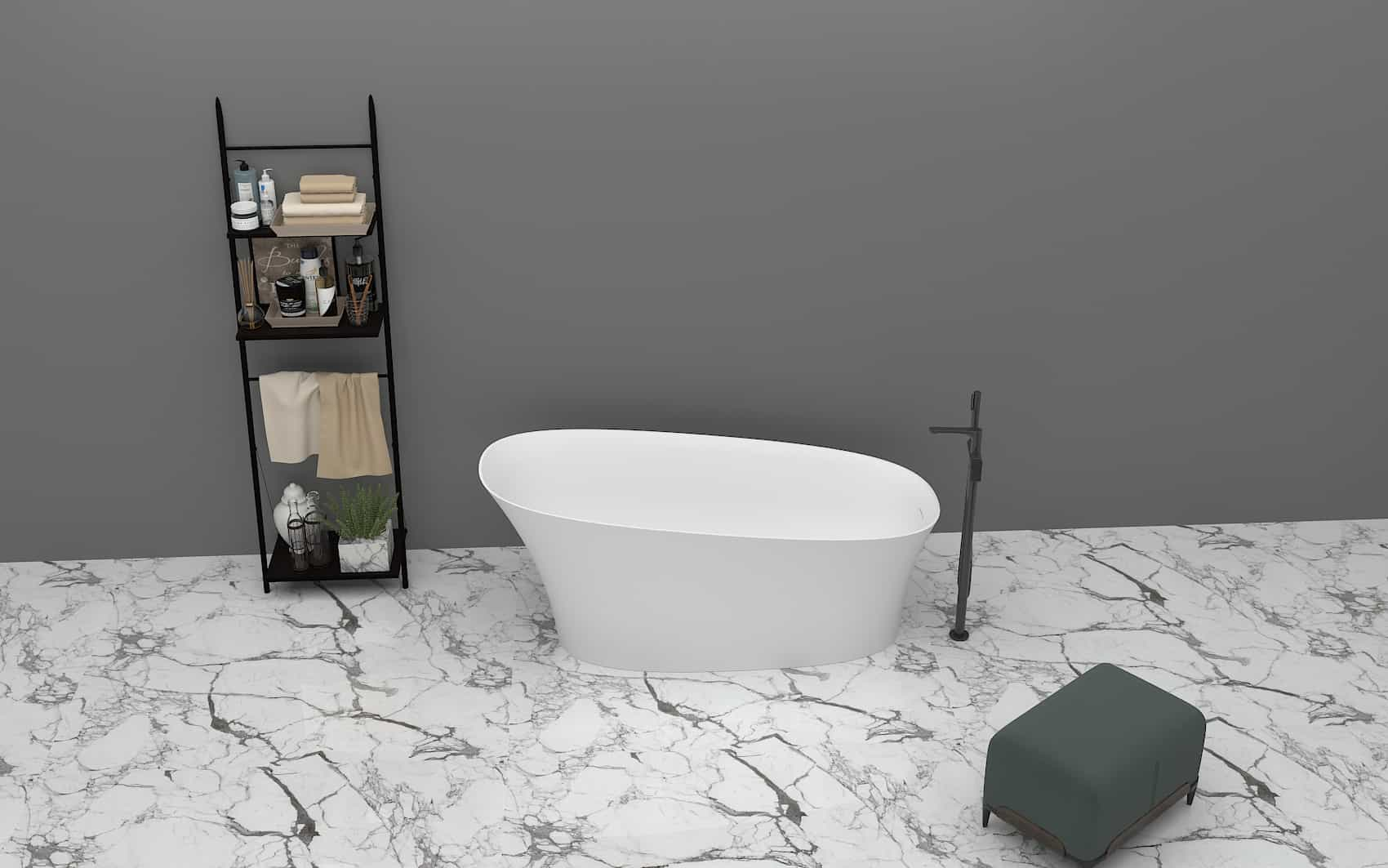
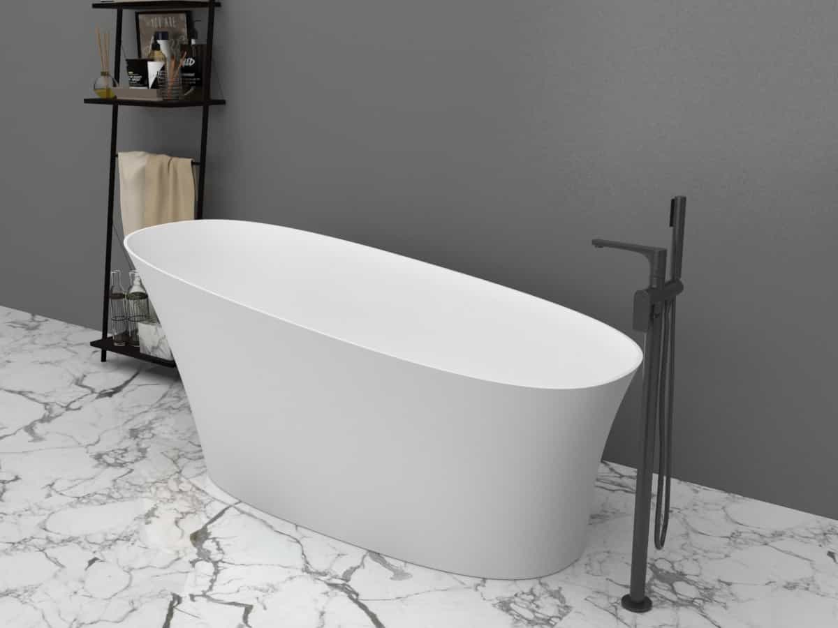
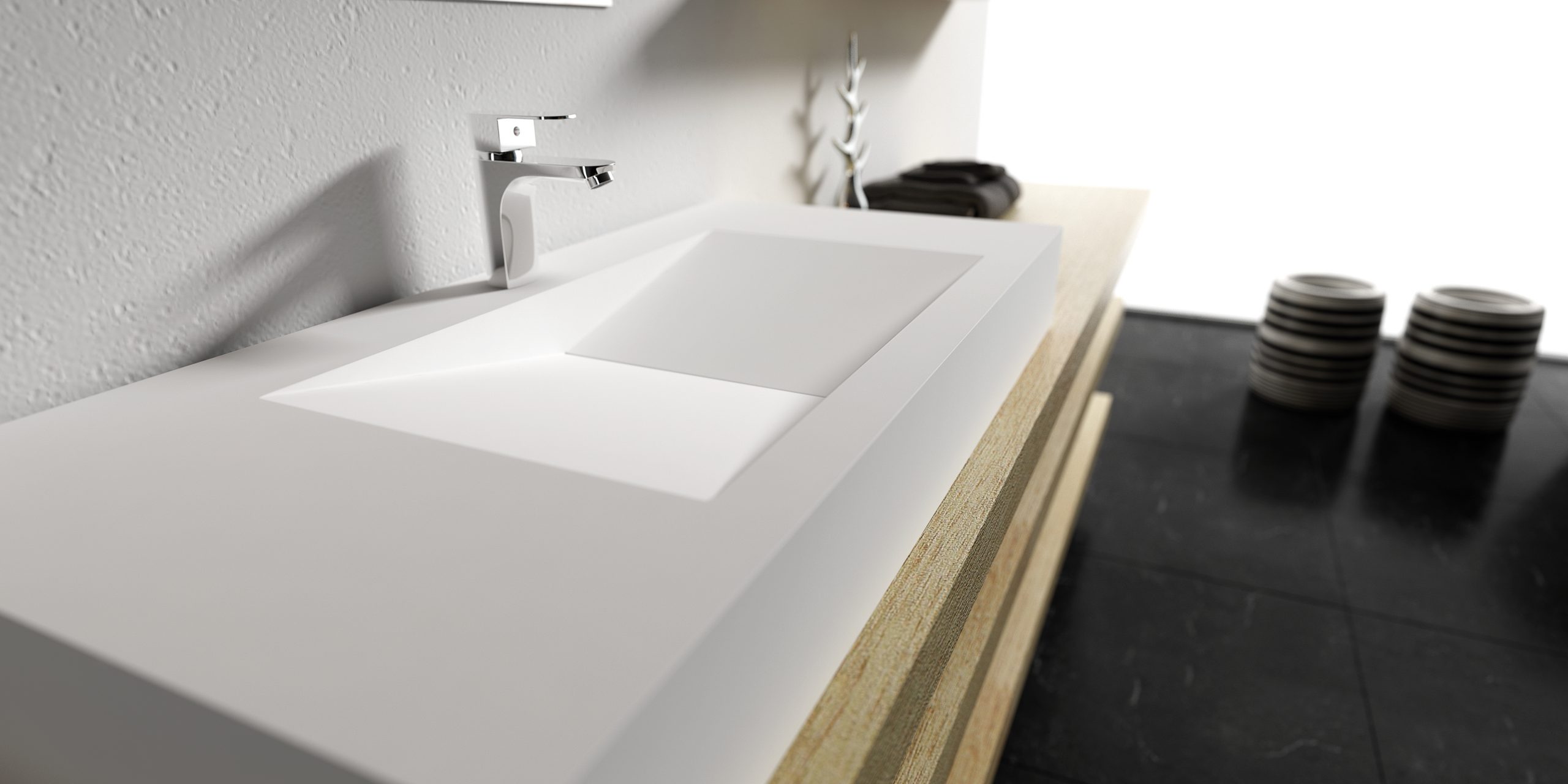
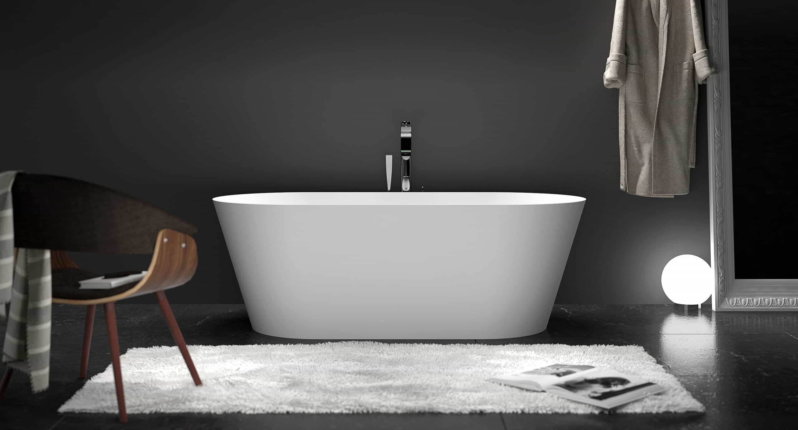
Option 1: black + white + gray = eternal classic
Black and white can create a strong visual effect, and the popular gray in recent years is integrated into it to ease the visual conflict between black and white, thus creating another different flavor. The space created by the three colors is full of cool modern and futuristic feeling. In this color situation, rationality, order and professionalism will emerge from simplicity.
The popular “Zen” style in recent years expresses primary colors, pays attention to environmental protection, and expresses the natural feeling of materials such as hemp, yarn, and coconut weaving with a colorless color matching method. It is a very modern, natural and rustic style.
Option 2: Silver blue + Dunhuang orange = modern + traditional
The color matching mainly in blue and orange shows the intersection of modernity and tradition, ancient and modern, colliding with a visual experience of both surreal and retro flavor. Blue and orange are originally strong contrasting colors, but there are some changes in the chromaticity of both sides, so that these two colors can give a new life to the space.
Plan Three: Yellow + Green = Joy of Newborns
In the living space of younger people, using goose yellow with purple blue or tender green is a good color scheme. Goose yellow is a fresh and tender color, which represents the joy of new life, and is most suitable for the home tone with a baby at home. If green is a tone that makes people feel calm, it can neutralize the lightness of yellow and make the space calm down. Therefore, this color matching method is very suitable for young couples.
Option 4: blue + white = romantic warmth
Most people don’t dare to try too bold colors at home, and think it is safer to use white. If you like to use white but are afraid of making your home look like a hospital, you might as well use a white + blue color scheme, just like on a Greek island, where all the houses are white, and the ceilings, floors, and streets are all painted with white lime. Presents pale tonality.
But the sky is light blue, and the sea is dark blue, showing the coolness and flawlessness of white. This kind of white makes people feel very free, as if it is a part of nature, and makes people open-minded. The home space seems to be like the sea and sky. Isshiki’s nature is as open and comfortable.
If you want to create such a Mediterranean style, you must limit the things at home, such as furniture, home accessories, curtains, etc., to one color system. Only in this way can there be a sense of unity. For those who yearn for blue sea and blue sky, white and blue are the best matching choices for your home life