


When we decorate the home, we will first order a favorite style, followed by the interior color collocation, because the interior decoration color will directly affect our decoration effect, so everyone attaches great importance to. And many owners have no decoration experience, do not understand the interior color collocation, then how to decorate? Now let’s share the principles of indoor color matching. Come and have a look.
Ten principles of color selection and matching for interior decoration:
Article 1: Space color matching shall not exceed three kinds, among which white and black are not considered colors.
Second: Gold and silver can be matched with any color. Gold does not include yellow and silver does not include off-white.
Third: home color matching in the absence of designer guidance under the best color matching gray is: wall light, the ground, furniture deep.
Rule 4: Don’t use warm colors in the kitchen, except yellow.
Rule 5: Don’t kill dark green floor tiles.
Rule 6: Never mix different materials of the same color together, even if no one is threatening to kill you. Otherwise, you have a 50/50 chance of making a mistake!
7. To create a bright, modern home look, avoid items (except plants) printed with large flowers and small flowers, and try to use solid colors.
8. The color of the ceiling must be lighter than or equal to the color of the wall. When the wall color is dark, the ceiling must be light. The ceiling can only be white or the same color as the wall.
Article 9: If the space is not enclosed and used, the same color scheme must be used. Different color schemes can be used for different enclosed Spaces.
Article 10: This “law” if used outside the home, 90% May be wrong!
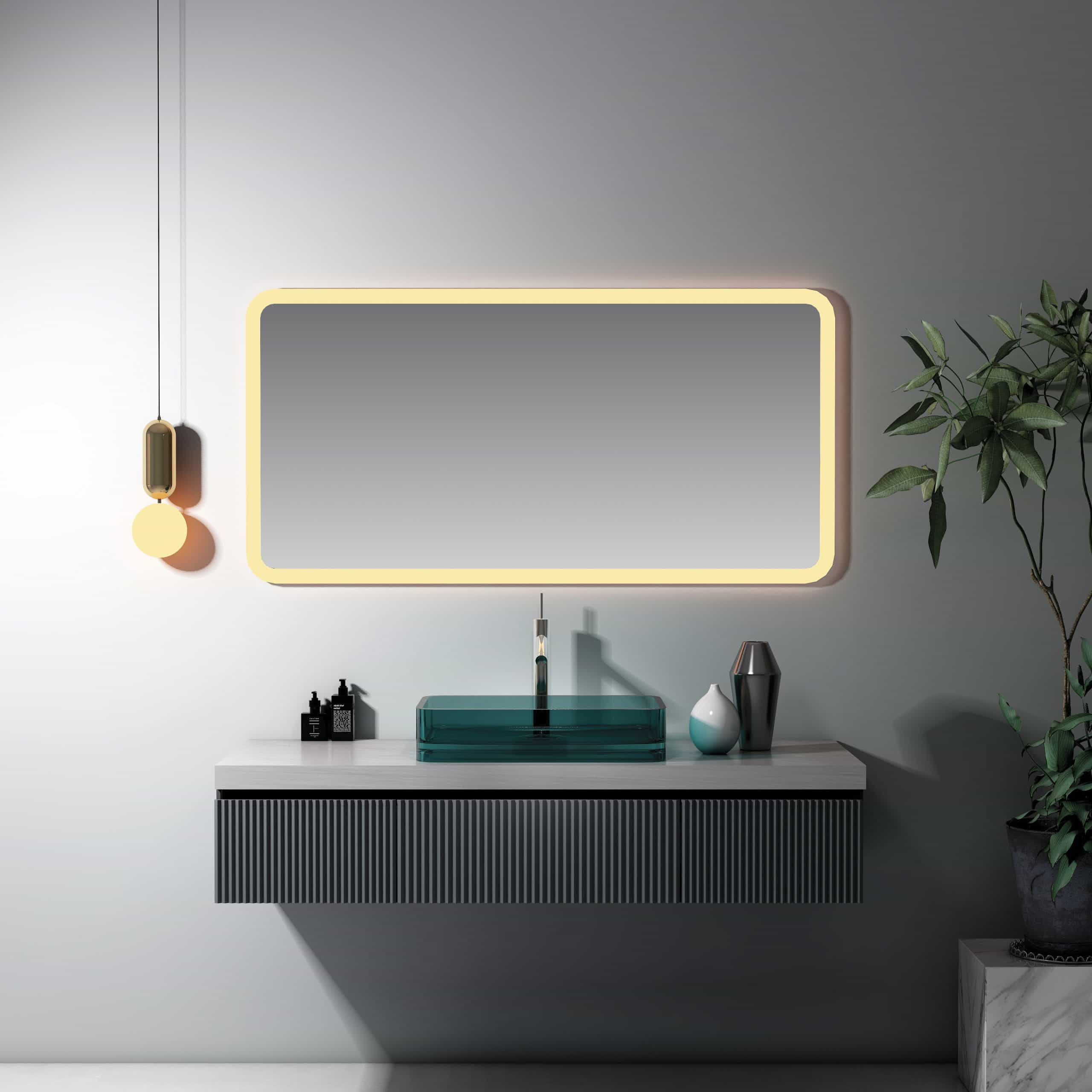
Color matching drawing of living room
Space color matching does not exceed three meanings:
1. Three colors in the same relatively enclosed space, including ceiling, wall, floor and furniture. The living room and the master room can have different colors of their own systems, but if the living room and the dining room are connected together, it is regarded as the same space
2. White, black, gray, gold and silver are not counted in the three color limits. But gold and silver generally do not exist at the same time, only one kind of gold or silver can be used in the same space.
3. The color of the pattern shall prevail. For example, a piece of floral cloth has a variety of colors, because the color has a variety of relations, so the professional to the main color prevail. The way is to squint to see, you can see the main tone. But a large pattern is also considered a color if the individual color blocks are large.
All kinds of space color selection and color matching should avoid:
Don’t decorate the dining room with blue
Blue has the function of regulating the nerves and calming the mind. But the food on a blue table or placemat is never as appetizing as in a warm environment; And don’t put incandescent or blue mood lights in the dining room. Scientific experiments have shown that blue lights make food look unappealing. However, blue as a bathroom decoration, but can strengthen the sense of mystery and privacy, it is worth a try.
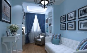
Living room do not use large areas of purple
Purple, the feeling seems to be quiet, fragile slender. But a large area of purple will make the overall tone of the space darker, resulting in a sense of oppression. It is recommended not to put in the need of cheerful atmosphere in the living room or children’s room, which will make the body in the people have a feeling of melancholy.
It’s best not to use orange in the bedroom
Orange is a vibrant, vibrant color. However, when it is used in the bedroom, it is not easy to calm people down, which is not conducive to sleep. However, if orange is used in the living room, it will create a cheerful atmosphere. Orange also has an appetite-inducing effect, making it an ideal color to decorate a restaurant. Orange is also comfortable with chocolate or beige.
Don’t use yellow in the study
Yellow, lovely and mature, elegant and natural. Fruity yellow with gentle character; Butter yellow radiates the prime mover; Golden color brings warmth. Yellow also has the effect of stabilizing mood and increasing appetite for healthy people. But prolonged exposure to high purity yellow can make people feel lazy. So yellow is the least suitable for the study, it will slow down the speed of thinking. It is suggested to decorate some yellow decorations in the guest room and dining room.